
Tidal
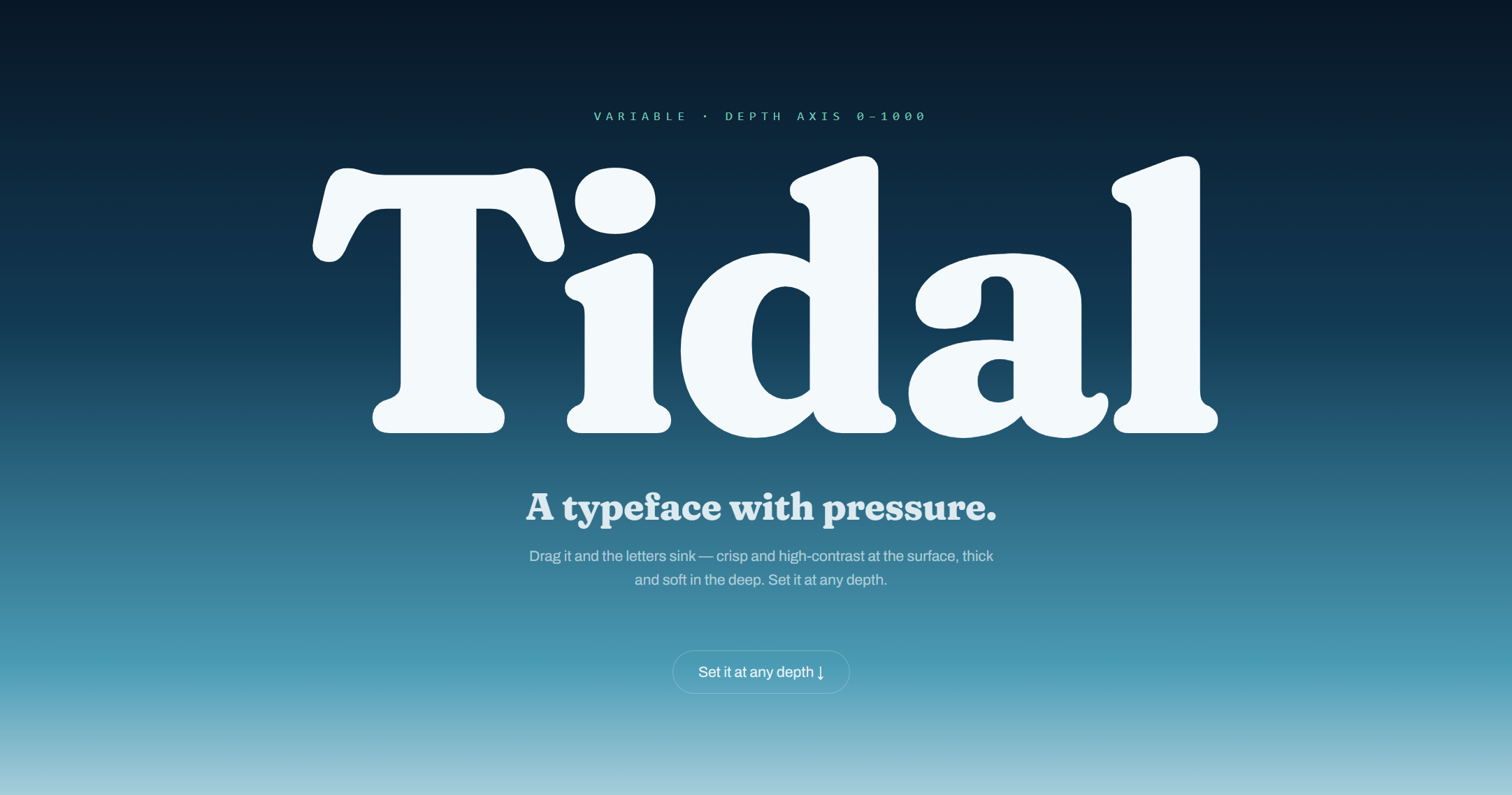
A type specimen for an invented typeface whose main axis is depth rather than weight. Drag the slider, or just scroll, and the letterforms sink underwater.
View live demo →- Platform
- v0
- Stack
- v0, variable font, CSS variable-font axes
What it is
Tidal is a showcase for a made-up typeface whose main control is not boldness but depth. Drag the slider from surface to abyss and the letters change as though they are sinking: sharp and high-contrast near the top, thicker and softer the further down you go, with the background darkening as you descend and caustics drifting across it the way light bends through water.
The slider has weight to it. Let go halfway through a drag and it carries on and settles rather than stopping dead, so moving through the range feels like moving something through water rather than moving a control. If you would rather not drag, scrolling the page takes you down instead.
You can type your own words and watch them sink. Below that, a waterfall runs the specimen down through every size in one column, and any single glyph can be opened on its own to see how it is drawn and what depth does to it. Wherever you end up has its own address, so one particular word at one particular depth is something you can send to somebody.
Why I made it
Everything else here leads with the engineering, and I wanted one piece that leads with how it looks. I also wanted to make something with a single idea in it that was mine, rather than a well-executed version of a layout I had seen before. The depth axis is that idea: the thing you play with and the concept of the typeface are the same gesture, so there was nothing to explain in a caption.
The craft
The depth slider is the only place the design does anything dramatic, and everything around it is deliberately quiet so that it is clearly the thing to look at. The palette comes from the idea of sinking through water rather than from a default. The two typefaces are a deliberate pairing, the sizes step in an intentional scale rather than arbitrary numbers, the drag is smooth, and the whole thing settles into a static version for anyone whose system asks for reduced motion. The writing on the page is in the typeface’s own voice instead of placeholder text, because a specimen full of lorem ipsum tells you nothing about how the letters behave in a real sentence.
One honest note: Tidal is not a real typeface. I used Fraunces, which is a real variable font, to stand in for it. This is a design and front-end piece, not a claim that I drew a typeface.