
Residence 724
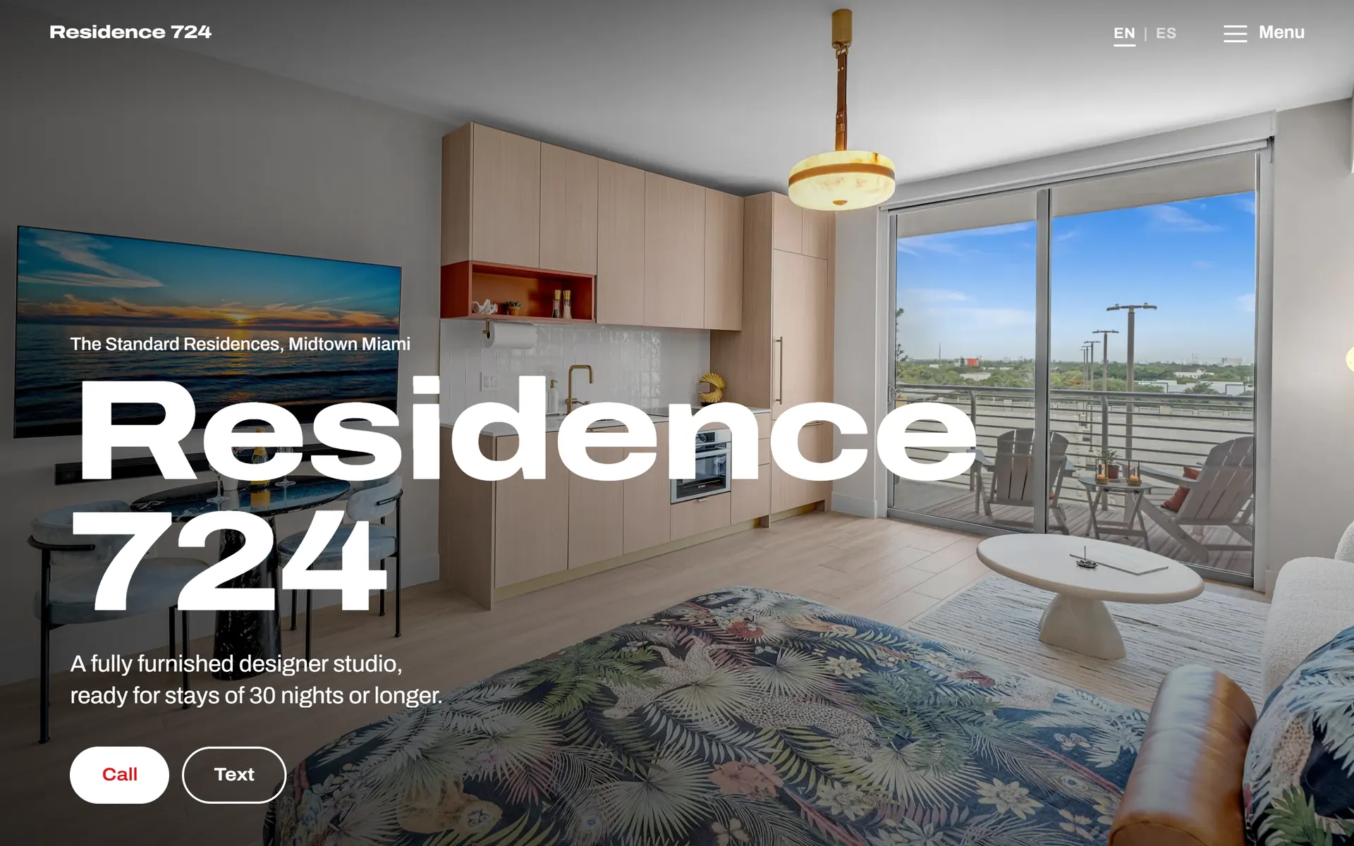
A one-page site for a furnished studio in Midtown Miami, in English and Spanish, with front-desk business cards whose two QR codes each open the page in their own language.
Visit miamistandard724.com →- Platform
- Static HTML/CSS/JS, built with Claude Code
- Stack
- HTML, CSS, vanilla JS, Cloudflare Pages, Cloudflare Registrar, GitHub, ffmpeg, Python (Pillow, segno)
What it is
A one-page site for a furnished studio in Midtown Miami, and the business cards that point at it. The owner could not sell the unit into a market that was not buying, so he decided to rent it furnished for stays of thirty nights and longer, and asked for a stack of cards on the building’s front desk with a QR code on them.
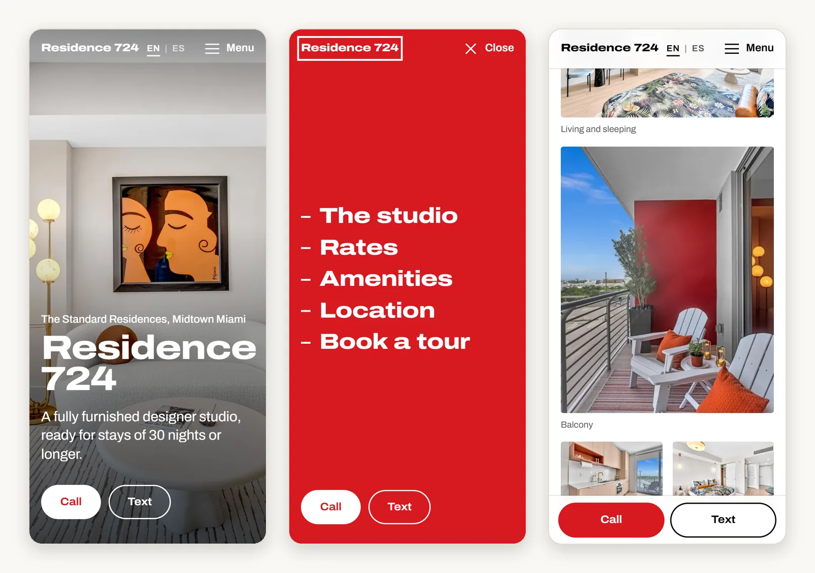
The whole thing is built around one moment: somebody standing in a lobby with a card in one hand and a phone in the other, who is not going to give it very long. It is one column, photographs first, with a contact bar that stays on screen the whole way down. There is no enquiry form and no booking flow, because the owner answers his own phone. About eight hours of work across three days.
It runs in English and in Spanish, because a good share of the people renting in Midtown at that price are Spanish speakers, and a page that only speaks English has quietly decided which of them it is for.
Why I built it this way
No framework and no build step, which is less a purist position than a reading of where the page gets opened. Whoever scans that code is standing up, on whatever signal a lift lobby has, and has half decided already to put their phone away. The page and all eighteen photos come to about 1.2 MB.
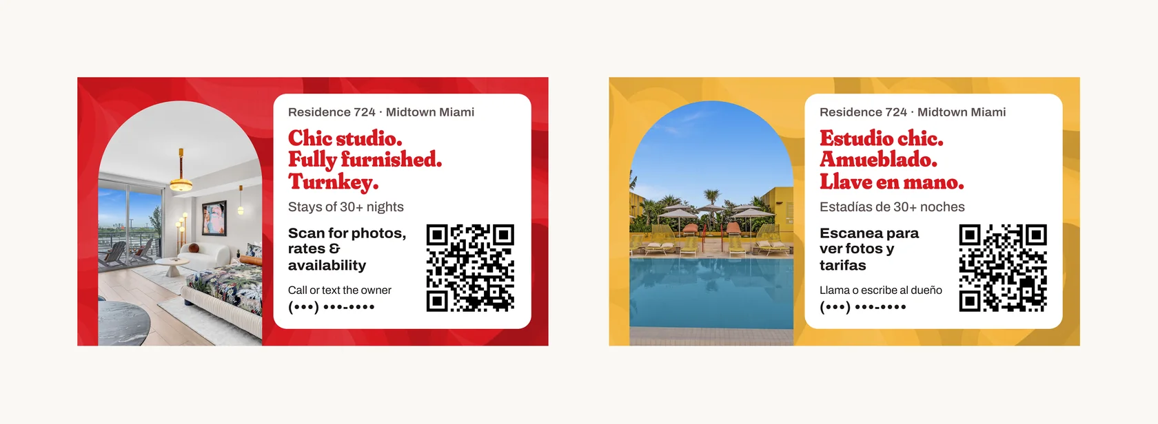
The look is borrowed from the building itself, which is cheerfully 1970s Miami, all bold reds and yellows, arched openings and a fat retro serif. I took that and did not take the logo, and the footer says plainly that this is a privately owned unit and not the building’s own page, because the owner is renting his apartment, not running the leasing office.
The part that took the actual thinking
The card is double-sided, English on one side and Spanish on the other, each side with its own QR code. That is a nice idea on paper, and it puts a constraint on the site that took me a while to get right: once five hundred cards are printed you cannot change where the codes point.
So each side has its own address, /card for English and /tarjeta for Spanish, and the address decides rather than anything the browser guesses. The page also remembers a visitor’s choice, and those two rules pull against each other: if the remembered one wins, somebody who once tapped EN out of curiosity scans the yellow side and gets English, which is the exact failure the second side of the card exists to prevent. So the address beats the stored preference, every time, and switching language on a card address moves the page to / so that a reload keeps the choice just made.
Giving each code its own path had a second effect I did not plan and am glad of. Cloudflare Web Analytics counts the two paths separately, so the owner can see which side of the card people are picking up.
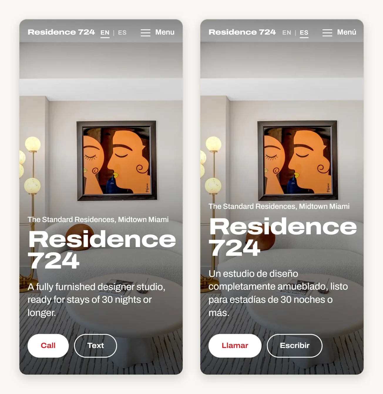
The Spanish is not mine. I do not speak it, so it is generated, aimed at the Latin American Spanish that Miami actually speaks rather than translated phrase by phrase. It is also the part of this project I can vouch for least, because I am not in a position to check the result myself.
The photos and the card
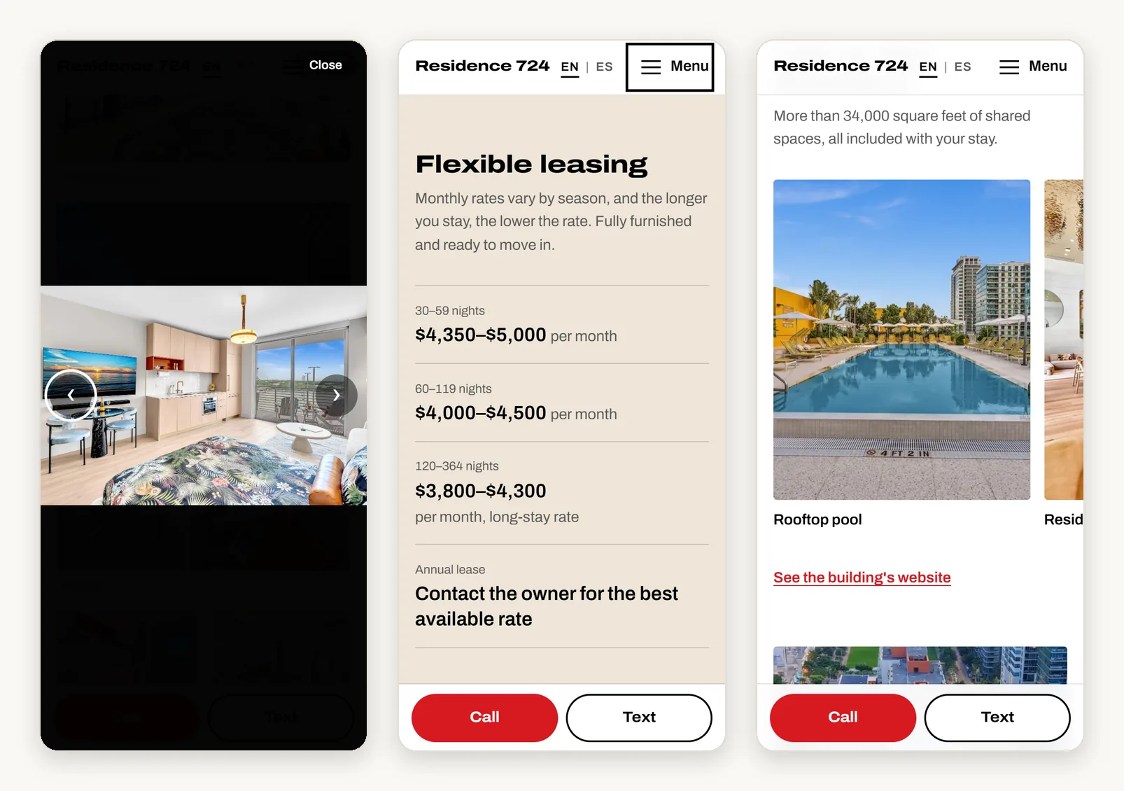
The realtor’s shoot came to seventy-nine photographs, several of them the same corner from slightly different places. I shortlisted eighteen, and the ten behind the “show more photos” button only download when somebody taps it. As WebP the set is roughly 1.2 MB, down from about 70 MB. From the walkthrough video I wanted one continuous aerial pass with no cuts in it, so it could loop silently behind the location section, and used ffmpeg to find the scene changes and the fade to black that marked where the usable passage began and ended.
The card is 3.5 × 2 inches with bleed, built as an HTML page rendered to a print-ready PDF with crop marks, so I could change the layout and look at it again straight away. It needed that. The first version was text on a flat colour and it was dull, and it picked up an arch-shaped photo window, a tone-on-tone fabric texture, and then a white panel behind the text once I found I could not comfortably read the small type on the red side. The copy is scan-first: the card’s whole job is to get the code scanned, so it leaves the rest to the page.
The deploy
A private GitHub repository connected to Cloudflare Pages, so pushing to the main branch is the deploy, with HTTPS redirects, DNSSEC, SPF and DMARC records and cache headers on top. The domain is registered in the owner’s own Cloudflare account with me added as a member rather than in mine, which is a little more setup and means he owns it outright, with nothing to hand over if he stops working with me.
The site is live, the cards are at the printer, and analytics is recording scans.
One honest note: analytics counts scans, not phone calls. I can tell you the cards are being scanned and which language people land in. I cannot tell you the page got anybody to ring him.
What I caught
I tested the finished cards by scanning them with my own phone, and the Spanish card opened in English.
Nothing was wrong with the code. iPhone Safari was holding a copy of the site’s JavaScript from before the card addresses existed, so /tarjeta was being handled by a script that had never heard of /tarjeta and fell back to the stored preference. The fix was versioned asset URLs, main.js?v=2026-09-16a rather than main.js, plus cache headers that revalidate the HTML on every visit while the versioned files stay cached.
It cannot happen on a phone that has never been to the site, which is every phone in the lobby and not the one in my hand, so the only reason I saw it is that I had been testing all week. And it is the worst thing here to find late, because the remedy for a QR code pointing at the wrong place is not a deploy, it is reprinting the cards.
What I would add next
The rates table is maintained by hand, so it will go out of date the first time the owner changes a price and does not think to mention it.
The photo viewer swipes and takes arrow keys, but it does not preload the photo either side of the one you are looking at, so on a weak connection a swipe shows an empty frame for a moment.
And the Spanish needs a native speaker in Miami to read it before the next batch of cards goes out. Since I cannot judge it myself, that is the one thing on this list I would not leave sitting.